Pairs Plot in Python using Seaborn
Creating a Pairs Plot using Python
One of my favorite functions in R is the pairs plot which makes high-level scatter plots to capture relationships between multiple variables within a dataframe. To my knowledge, python does not have any built-in functions which accomplish this so I turned to Seaborn, the statistical visualization library built on matplotlib, to accomplish this.
#import seaborn
import seaborn as sb
sb.set(font_scale=1.35, style="ticks") #set styling preferences
%matplotlib inline
Load the example iris dataset
iris = sb.load_dataset("iris")
iris.head()
| sepal_length | sepal_width | petal_length | petal_width | species | |
|---|---|---|---|---|---|
| 0 | 5.1 | 3.5 | 1.4 | 0.2 | setosa |
| 1 | 4.9 | 3.0 | 1.4 | 0.2 | setosa |
| 2 | 4.7 | 3.2 | 1.3 | 0.2 | setosa |
| 3 | 4.6 | 3.1 | 1.5 | 0.2 | setosa |
| 4 | 5.0 | 3.6 | 1.4 | 0.2 | setosa |
Look at a summary of the data
iris.describe()
| sepal_length | sepal_width | petal_length | petal_width | |
|---|---|---|---|---|
| count | 150.000000 | 150.000000 | 150.000000 | 150.000000 |
| mean | 5.843333 | 3.057333 | 3.758000 | 1.199333 |
| std | 0.828066 | 0.435866 | 1.765298 | 0.762238 |
| min | 4.300000 | 2.000000 | 1.000000 | 0.100000 |
| 25% | 5.100000 | 2.800000 | 1.600000 | 0.300000 |
| 50% | 5.800000 | 3.000000 | 4.350000 | 1.300000 |
| 75% | 6.400000 | 3.300000 | 5.100000 | 1.800000 |
| max | 7.900000 | 4.400000 | 6.900000 | 2.500000 |
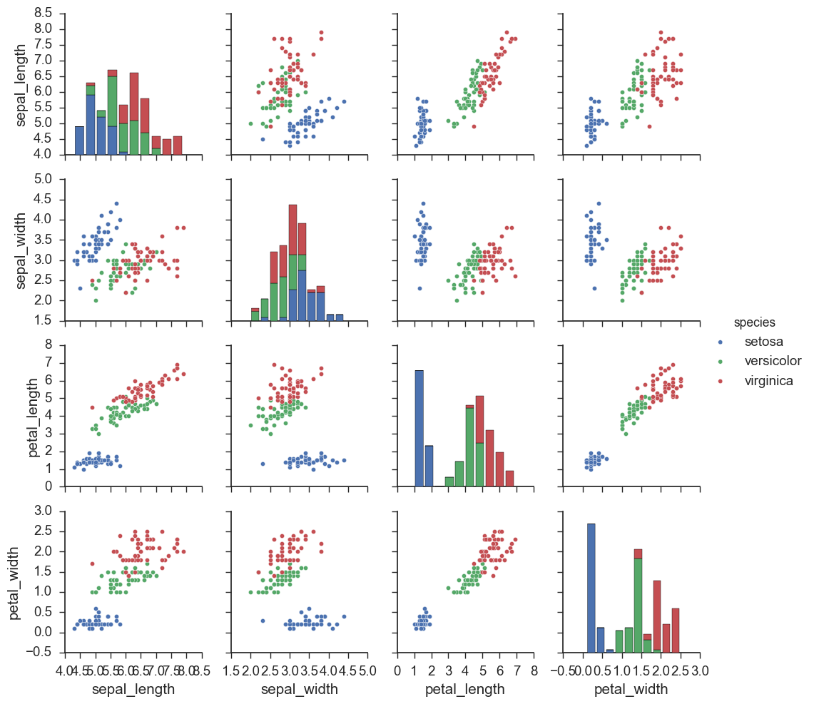
plot = sb.pairplot(iris, hue='species')
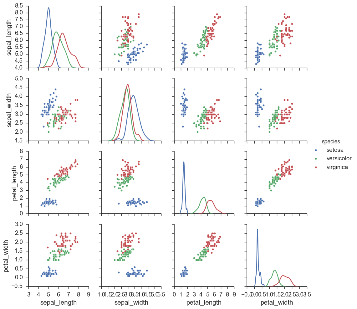
Change the bar plot to lines graphs.
plot = sb.pairplot(iris, hue='species', diag_kind='kde')
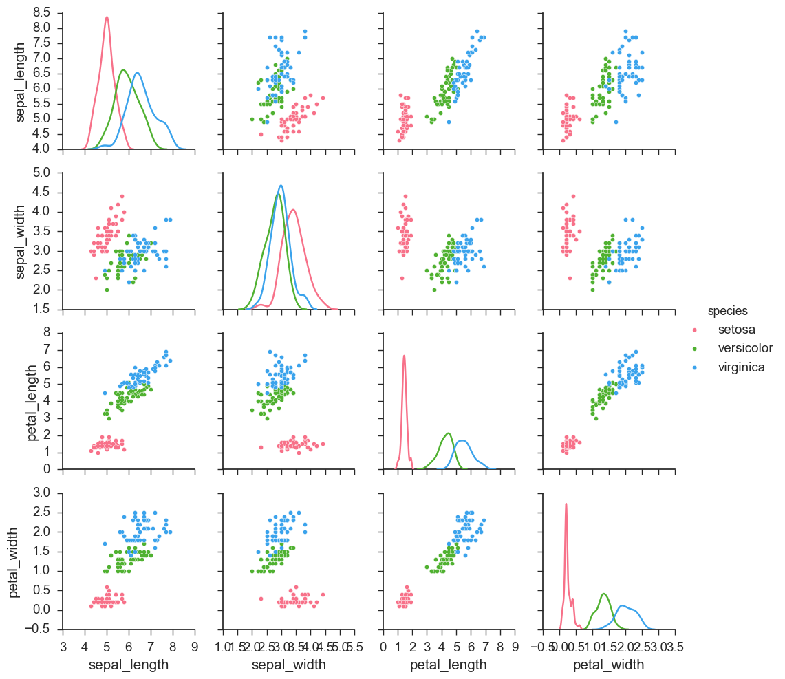
Change the palette of the plot.
plot = sb.pairplot(iris, hue='species', diag_kind='kde',palette='husl')