Scatter Plot in Python using Seaborn
Scatter Plot using Seaborn
One of the handiest visualization tools for making quick inferences about relationships between variables is the scatter plot. We're going to be using Seaborn and the boston housing data set from the Sci-Kit Learn library to accomplish this.
import pandas as pd
import seaborn as sb
%matplotlib inline
from sklearn import datasets
import matplotlib.pyplot as plt

sb.set(font_scale=1.2, style="ticks") #set styling preferences
dataset = datasets.load_boston()

#convert to pandas data frame
df = pd.DataFrame(dataset.data, columns=dataset.feature_names)
df['target'] = dataset.target
df.head()
df = df.rename(columns={'target': 'median_value', 'oldName2': 'newName2'})
df.DIS = df.DIS.round(0)
Describe the data
df.describe().round(1)
| CRIM | ZN | INDUS | CHAS | NOX | RM | AGE | DIS | RAD | TAX | PTRATIO | B | LSTAT | median_value | |
|---|---|---|---|---|---|---|---|---|---|---|---|---|---|---|
| count | 506.0 | 506.0 | 506.0 | 506.0 | 506.0 | 506.0 | 506.0 | 506.0 | 506.0 | 506.0 | 506.0 | 506.0 | 506.0 | 506.0 |
| mean | 3.6 | 11.4 | 11.1 | 0.1 | 0.6 | 6.3 | 68.6 | 3.8 | 9.5 | 408.2 | 18.5 | 356.7 | 12.7 | 22.5 |
| std | 8.6 | 23.3 | 6.9 | 0.3 | 0.1 | 0.7 | 28.1 | 2.1 | 8.7 | 168.5 | 2.2 | 91.3 | 7.1 | 9.2 |
| min | 0.0 | 0.0 | 0.5 | 0.0 | 0.4 | 3.6 | 2.9 | 1.0 | 1.0 | 187.0 | 12.6 | 0.3 | 1.7 | 5.0 |
| 25% | 0.1 | 0.0 | 5.2 | 0.0 | 0.4 | 5.9 | 45.0 | 2.0 | 4.0 | 279.0 | 17.4 | 375.4 | 7.0 | 17.0 |
| 50% | 0.3 | 0.0 | 9.7 | 0.0 | 0.5 | 6.2 | 77.5 | 3.0 | 5.0 | 330.0 | 19.0 | 391.4 | 11.4 | 21.2 |
| 75% | 3.6 | 12.5 | 18.1 | 0.0 | 0.6 | 6.6 | 94.1 | 5.0 | 24.0 | 666.0 | 20.2 | 396.2 | 17.0 | 25.0 |
| max | 89.0 | 100.0 | 27.7 | 1.0 | 0.9 | 8.8 | 100.0 | 12.0 | 24.0 | 711.0 | 22.0 | 396.9 | 38.0 | 50.0 |
Variable Key
| Variable | Name |
|---|---|
| CRIM | per capita crime rate by town |
| ZN | proportion of residential land zoned for lots over 25,000 sq.ft. |
| INDUS | proportion of non-retail business acres per town |
| CHAS | Charles River dummy variable (= 1 if tract bounds river; 0 otherwise) |
| NOX | nitric oxides concentration (parts per 10 million) |
| RM | average number of rooms per dwelling |
| AGE | proportion of owner-occupied units built prior to 1940 |
| DIS | weighted distances to five Boston employment centres |
| RAD | index of accessibility to radial highways |
| TAX | full-value property-tax rate per \$10,000 |
| PTRATIO | pupil-teacher ratio by town |
| B | 1000(Bk - 0.63)^2 where Bk is the proportion of blacks by town |
| LSTAT | % lower status of the population |
| median_value | Median value of owner-occupied homes in $1000's |
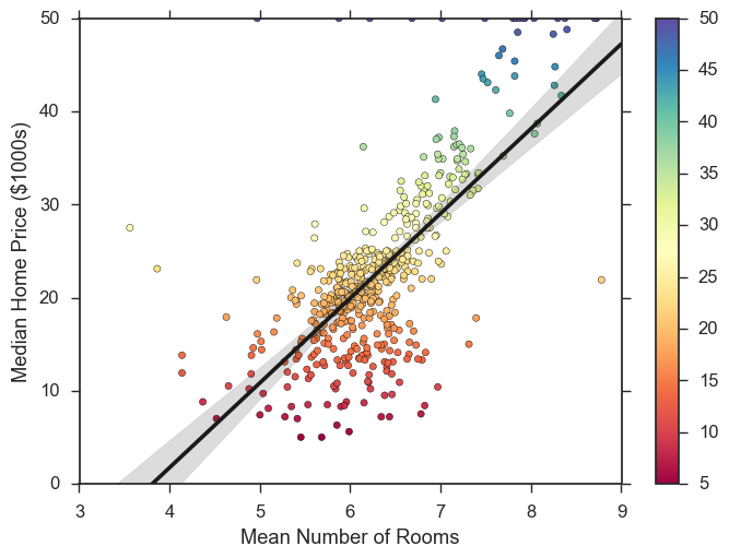
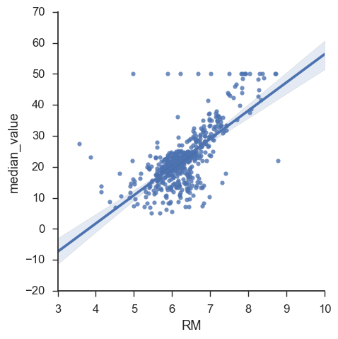
Barebones scatter plot
plot = sb.lmplot(x="RM", y="median_value", data=df)
Add some color and re-label
points = plt.scatter(df["RM"], df["median_value"],
                     c=df["median_value"], s=20, cmap="Spectral") #set style options

#add a color bar
plt.colorbar(points)

#set limits
plt.xlim(3, 9)
plt.ylim(0, 50)

#build the plot
plot = sb.regplot("RM", "median_value", data=df, scatter=False, color=".1")
plot = plot.set(ylabel='Median Home Price ($1000s)', xlabel='Mean Number of Rooms') #add labels