Principle Component Analysis (PCA) with Scikit-Learn
Principal Component Analysis (PCA) in Python using Scikit-Learn
Principal component analysis is a technique used to reduce the dimensionality of a data set. PCA is typically employed prior to implementing a machine learning algorithm because it minimizes the number of variables used to explain the maximum amount of variance for a given data set.
PCA Introduction
PCA uses "orthogonal linear transformation" to project the features of a data set onto a new coordinate system where the feature which explains the most variance is positioned at the first coordinate (thus becoming the first principal component). Source
PCA allows us to quantify the trade-offs between the number of features we utilize and the total variance explained by the data. PCA allows us to determine which features capture similiar information and discard them to create a more parsimonious model.
In order to perform PCA we need to do the following:
PCA Steps
- Standardize the data.
- Use the standardized data to create a covariance matrix.
- Use the resulting matrix to calculate eigenvectors (principal components) and their corresponding eigenvalues.
- Sort the components in decending order by its eigenvalue.
- Choose n components which explain the most variance within the data (larger eigenvalue means the feature explains more variance).
- Create a new matrix using the n components.
NOTE: PCA compresses the feature space so you will not be able to tell which variables explain the most variance because they have been transformed. If you'd like to preserve the original features to determine which ones explain the most variance for a given data set, see the SciKit Learn Feature Documentation.
Resources 1. District data labs 2. chris 3. implementation 4. More
#Imports
import matplotlib.pyplot as plt
import numpy as np
import pandas as pd
from sklearn import decomposition
from sklearn.preprocessing import scale
from sklearn.decomposition import PCA
import seaborn as sb
%matplotlib inline
/Users/ernestt/venv/lib/python2.7/site-packages/matplotlib/font_manager.py:273: UserWarning: Matplotlib is building the font cache using fc-list. This may take a moment.
  warnings.warn('Matplotlib is building the font cache using fc-list. This may take a moment.')
sb.set(font_scale=1.2,style="whitegrid") #set styling preferences

loan = pd.read_csv('loan.csv').sample(frac = .25) #read the dataset and sample 25% of it
/Users/ernestt/venv/lib/python2.7/site-packages/IPython/core/interactiveshell.py:2717: DtypeWarning: Columns (19,55) have mixed types. Specify dtype option on import or set low_memory=False.
  interactivity=interactivity, compiler=compiler, result=result)
For this example, we're going to use the Lending Club data set which can be found here.
#Data Wrangling
loan.replace([np.inf, -np.inf], np.nan) #convert infs to nans
loan = loan.dropna(axis = 1, how = 'any') #remove nans
loan = loan._get_numeric_data() #keep only numeric features
Step 1: Standardize the Dataset
x = loan.values #convert the data into a numpy array
x = scale(x);x
array([[ 1.17990021,  1.17491004, -0.61220612, ..., -0.07607754,
        -0.38999916,  0.        ],
       [ 1.57614469,  1.58965176,  0.14553604, ..., -0.07607754,
        -0.45317429,  0.        ],
       [ 0.50760835,  0.50047945,  0.40304998, ..., -0.07607754,
        -0.35598935,  0.        ],
       ...,
       [ 1.16244466,  1.15544092,  0.85591931, ..., -0.07607754,
        -0.34906088,  0.        ],
       [-1.13519249, -1.11536499, -0.6299657 , ..., -0.07607754,
         0.6887011 ,  0.        ],
       [ 1.35264446,  1.35535277,  0.26393325, ..., -0.07607754,
         3.15726473,  0.        ]])
Step 2: Create a Covariance Matrix
covar_matrix = PCA(n_components = 20) #we have 20 features
Step 3: Calculate Eigenvalues
covar_matrix.fit(x)
variance = covar_matrix.explained_variance_ratio_ #calculate variance ratios

var=np.cumsum(np.round(covar_matrix.explained_variance_ratio_, decimals=3)*100)
var #cumulative sum of variance explained with [n] features
array([  33. ,   58.9,   68.8,   75.8,   81.6,   86.7,   91.8,   95.3,
         97.2,   98.4,   99.4,   99.8,  100.1,  100.1,  100.1,  100.1,
        100.1,  100.1,  100.1,  100.1])
In the above array we see that the first feature explains roughly 33% of the variance within our data set while the first two explain 58.9 and so on. If we employ 10 features we capture 98.4% of the variance within the dataset, thus we gain very little by implementing an additional feature (think of this as diminishing marginal return on total variance explained).
Step 4, 5 & 6: Sort & Select
plt.ylabel('% Variance Explained')
plt.xlabel('# of Features')
plt.title('PCA Analysis')
plt.ylim(30,100.5)
plt.style.context('seaborn-whitegrid')


plt.plot(var)
[<matplotlib.lines.Line2D at 0x11666a910>]
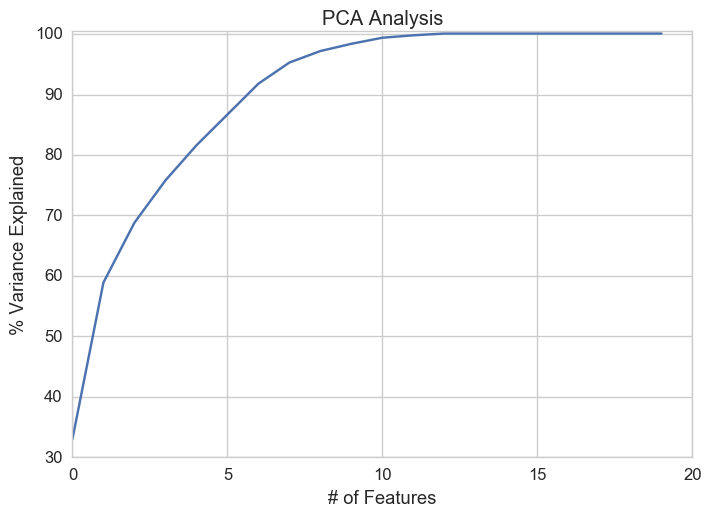
Based on the plot above it's clear we should pick 10 features.